Commit UI
I created final UI designs for a crowdfunding event management software.
Roles:
UX designer
UI designer
Project manager
Not my first Commit rodeo
After a UX design partnership while at Designation (view that case study here), Commit’s CEO Mia Velasquez reached out to partner with me again on another project – to revamp the site’s UI, redesign specific screens, and give event organizers a better event management experience. Commit’s objective is to create a platform event organizers can use to crowdfund money prior to an event to gauge desirability and alleviate the stress and risk of up-front costs.
Commit finished an iteration of designing with another designation UI design team and gave specifications on what they wanted to take from the UI designer’s Sketch files. Mia wanted the designs to be approachable, trustworthy, and keep the signature Commit pink while adding a navy to balance it out.
I met with Mia to discuss the parameters of the project. We sketched different approaches to a structural redesign together and agreed upon key design function goals. There were four main pieces I focused on during this partnership.
Event cards

Facebook’s card layout was minimal, the lines give the information more structure. We wanted to keep the date as prominent information, but insert a countdown clock to incite a more urgent Commitment process.

Eventbrite
Eventbrite’s had the same information as Facebook’s card layout and its effective use of whitespace felt cleaner to the eye. We still wanted to encourage attendees to commit to a Commit event sooner rather than later with the countdown clock.
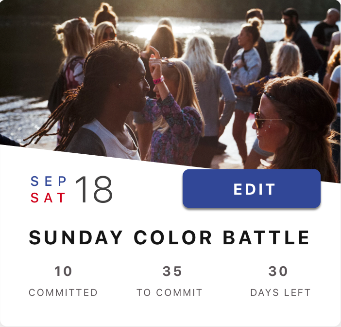
Previous designers
Mia also gave me all deliverables from previous UI designers. She highlighted a UI feature she wanted to keep: a slanted line on the card separating the event’s picture from the event’s information.

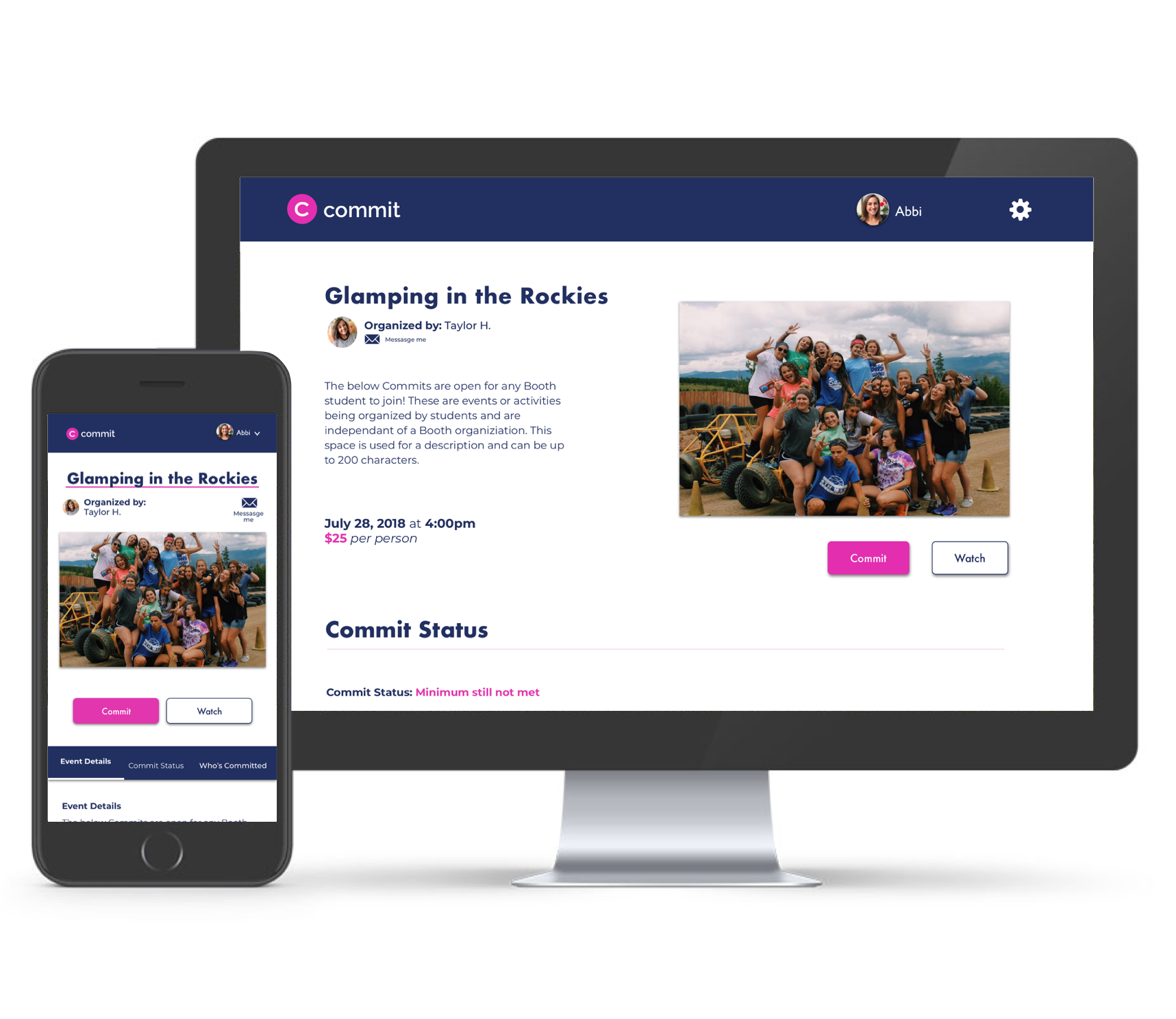
After researching, I created the above card layout. While keeping in mind Commit’s priorities, I kept the title, date, and countdown clock as important highlights on the cards.
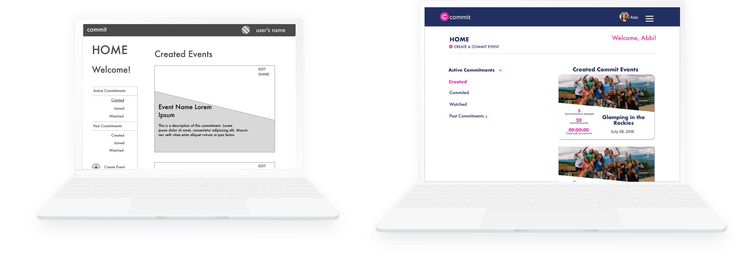
2. Navigation
I wireframed and collaborated with Mia to ensure the functions of the Home Page were transferred over. I created a side navigation in the desktop and tab formation in the Mobile screens to give event organizers a simple page orienting experience.

3. Event page redesign

The previous teams had only designed a long scroll mobile experience for the Create and Edit Event pages. I redesigned the pages to have an accordion structure for easy access to section titles and easy page orientation.
To make less work on development’s end, the Create and Edit event pages have the exact same UI elements. This way, the users have a familiar structure to edit their events and the developers didn’t have to create different HTML pages.
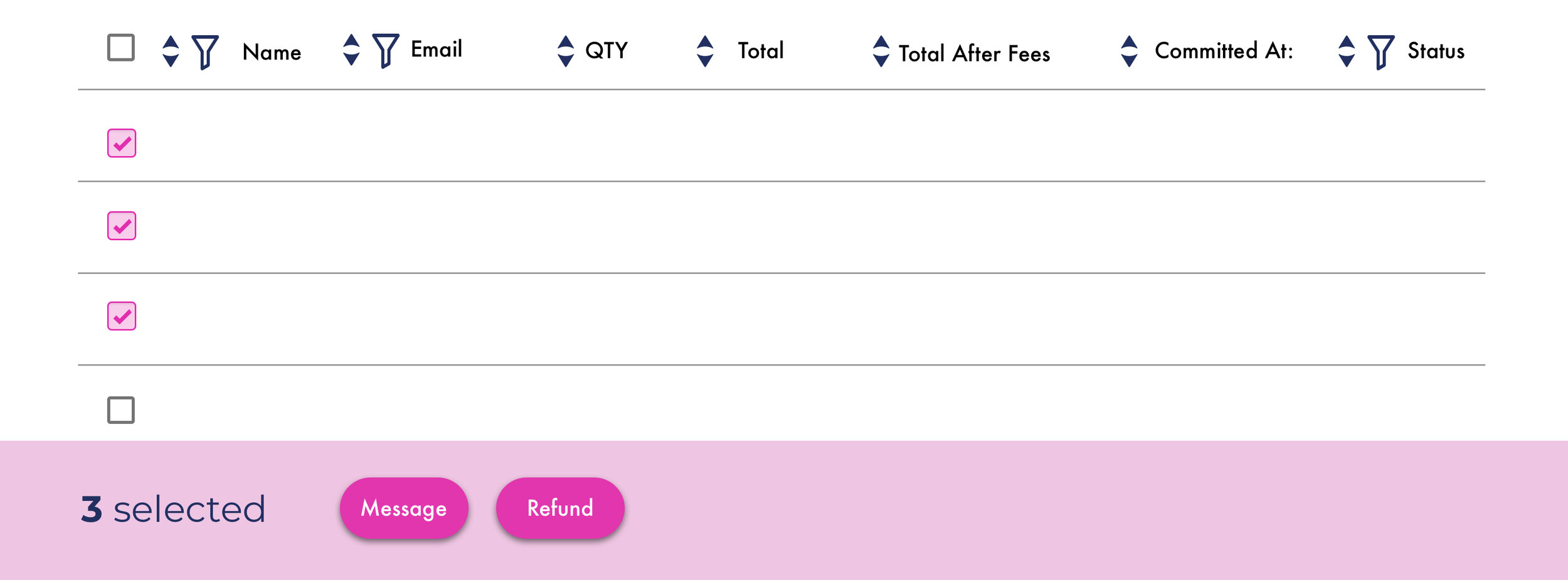
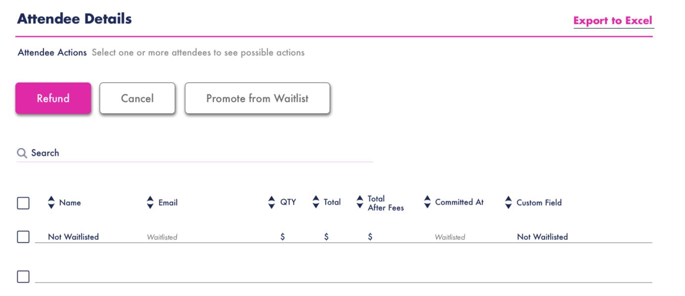
4. Attendee management system
I researched multiple ways to show possible actions on the Attendee Management page. I configured two options, one inspired by an action function in Calendly and another with a “select attendees and action appears” function.
On Calendly’s meeting organization function, when you select a meeting, actions pop up on the bottom of the screen. We wanted to use that pattern for actions an event organizer could take with their attendee lists. It was a sleek way to show the possible actions an event organizer could take.
A first iteration of the attendee management system. This was inspired by Calendly’s action bar interaction pattern.
Could it work?
I collaborated with the development team to validate the feasibility of the designs. After a few iterations, we decided as a team to move forward with the “select attendees and action appears” function for now, and added the sleeker action step as a future roadmap consideration.
I created another solution for the actions an event organizer could take. The actions appeared in bubbles above the attendee list when an attendee or multiple attendees were selected.
When an attendee or multiple attendees are selected, the possible actions an event organizer could take appear as buttons above the list. If clicked on, these action buttons become the signature Commit pink.
Final design hand-off
Michelle, my teammate, and I created desktop and mobile screens and communicated design and brand details to the development team through Zeplin files. We collaborated with Mia to create copy, rework the site’s branding, and consolidate pre-existing features or pages into smoother and simpler user experiences.
Midway through the project, Commit added another designer, Michelle Ciappa, who worked with Commit on a Designation UI team, to the design team to help enhance the site’s UI. I learned so much about the proper sketch and UI design etiquette from working alongside her. Together, we created to comprehensive style across all desktop and mobile screens we designed.
What I gleaned
I refined my information architecture skills and became more comfortable using my UI designs skills. I honed my visual design skills more through this project by gaining feedback from Michelle and Mia and iterating according to standard design patterns.
The opportunity to work with developers taught me how to communicate with the developers in this team and ask the right questions of them at the right times throughout the project. I grasped the importance of clear and concise communication with a development team. I learned how to utilize Zeplin and the many details it can capture in a Sketch or AI file to aid in that clear design communication.